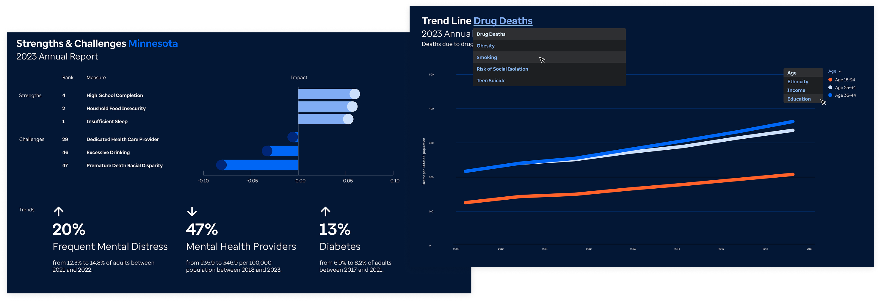
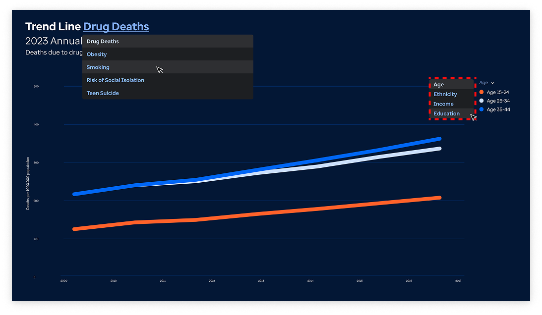
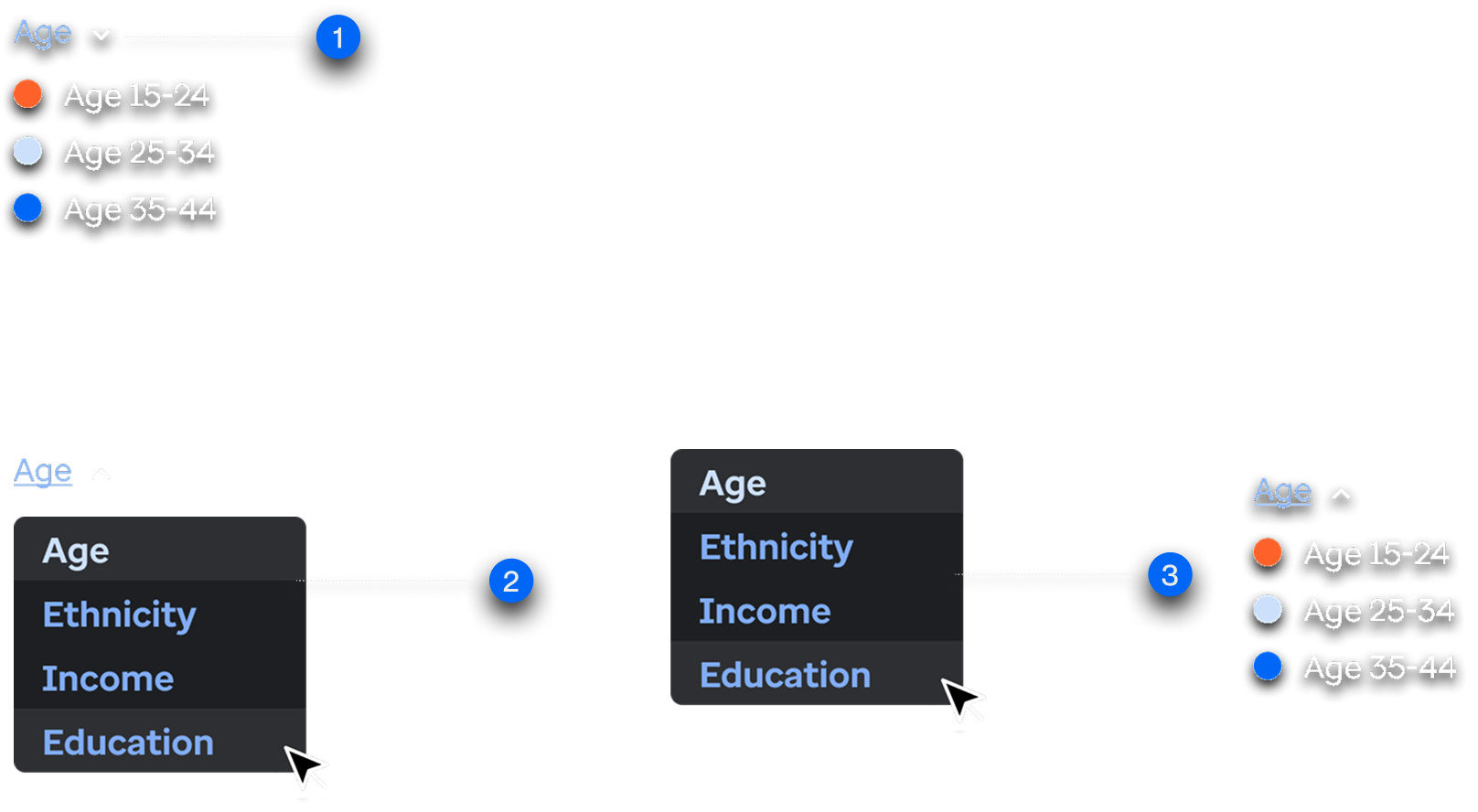
Iteration 1: Population Groups Selection
Within the population trend line, the user's goal is to switch and compare between different population demographics.
Familiarity vs Practicality
1. Dropdown added to convey switching between demographics on visualization.
2. If dropdown positioned conventionally below, it would hide the current demographics displayed on the trend line.
3. Dropdown on the left side would necessarily convey what is currently displayed on the visualization, albeit an unconventional positioning.
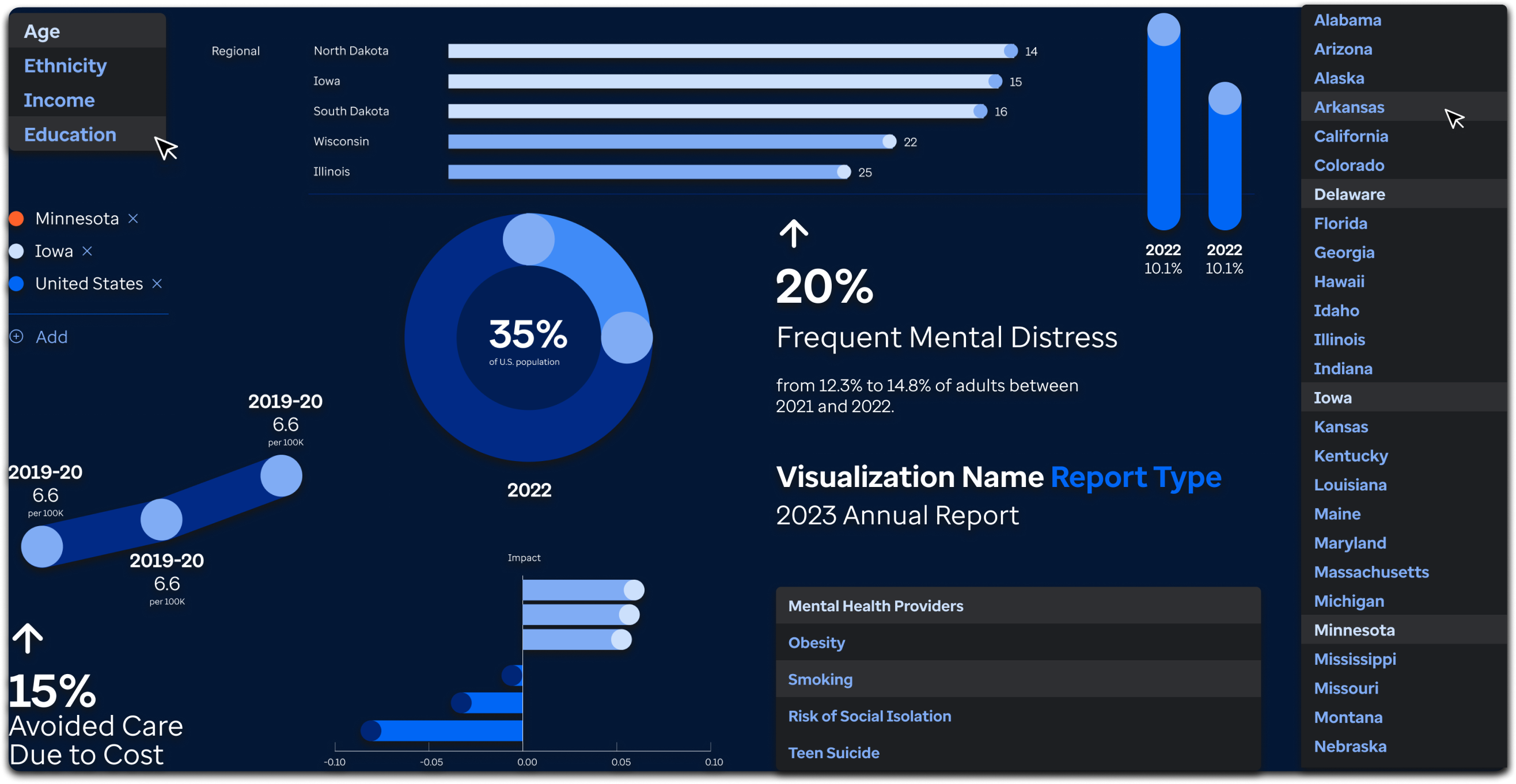
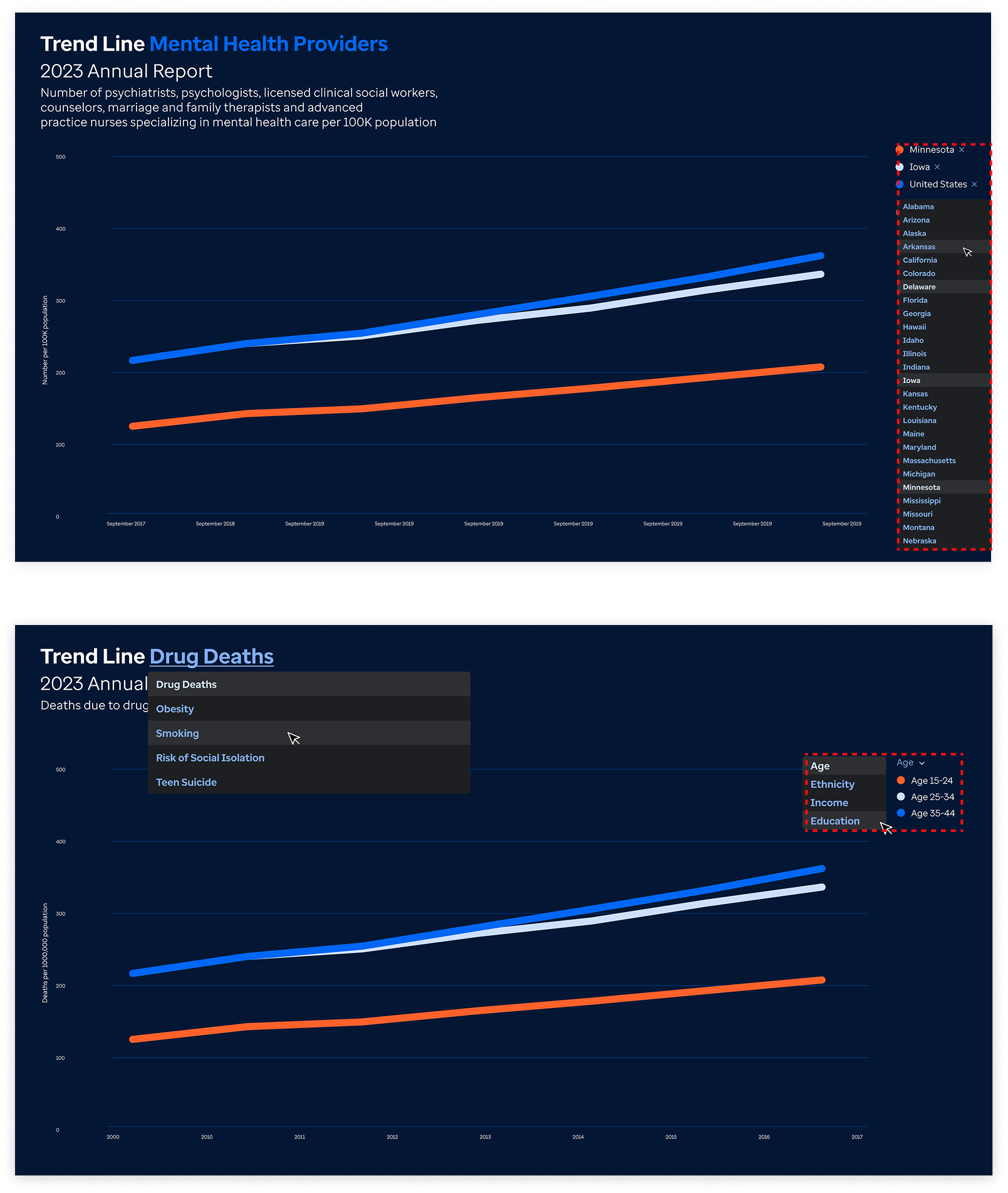
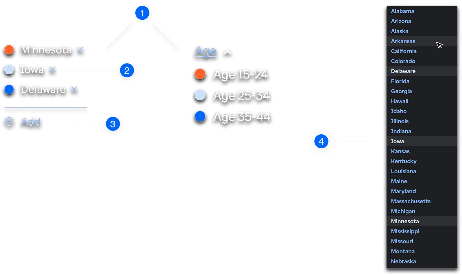
Iteration 2: State Selection
Within the state trend line, the user's goal is to add or remove U.S states within the line chart visualization.
Common Behavior vs Edge Cases
1. These components are similar but serve different purposes.
2. The ability to remove states from the legend is a distinctive feature of the state trendline visualization.
3. Deselecting ability is kept within the dropdown, but is prioritized within legend.
4. A feature to add states is used here instead of a dropdown component to emphasize the distinction between "switching populations" and "adding states”.
Removing states via the modal was prioritized considering most users compare only between 10 states, despite rare edge cases where the user might favor deselecting within the dropdown for more than 10 states.