EVALUATION
There were minor inconsistencies, but overall the design reflected Google Maps standards
I focused on distinct criteria of assessment, including evaluating the visual design’s adherence to established design standards and assessing whether it met the expectations of the target user group.
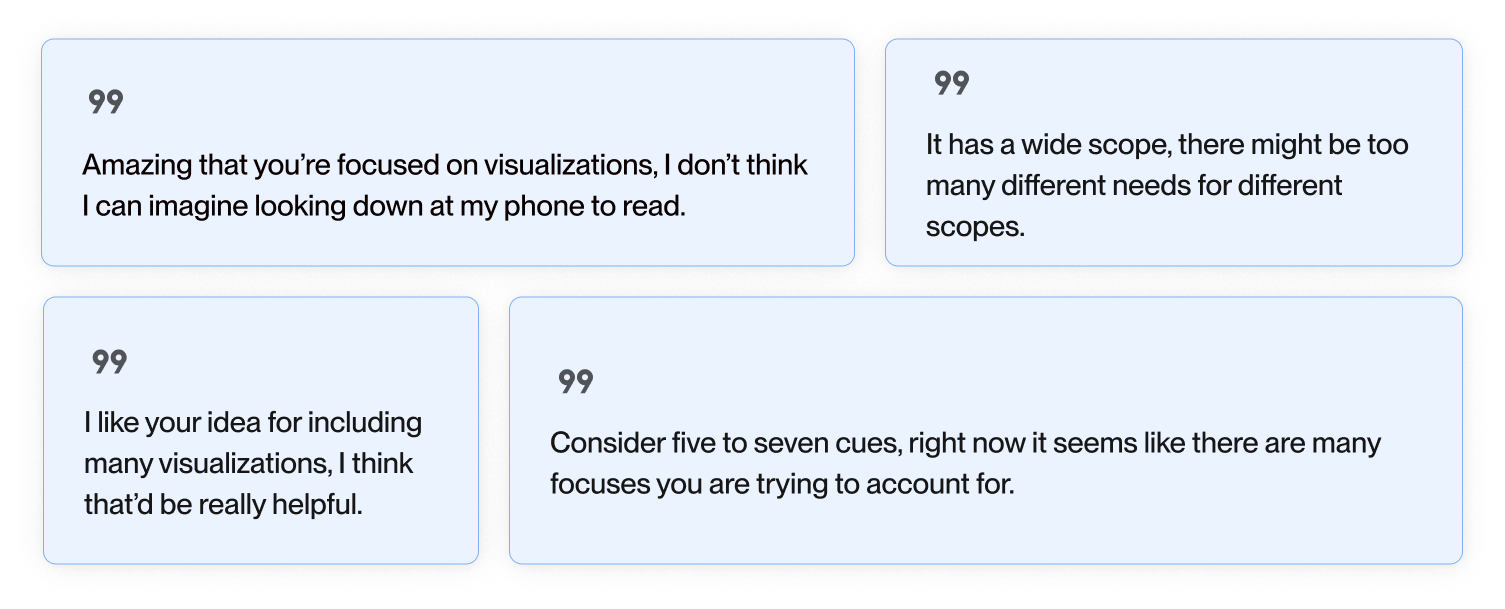
Below, are three design considerations that we addressed upon receiving feedback on our designs from users and experts.
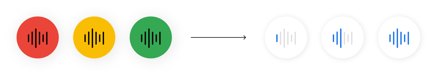
1 – Relying solely on color to convey information is not accessible, especially for colorblind users
Color indicators were replaced with audio bars that increase with background noise, an affordance for how close a transportation vehicle is to arrival.
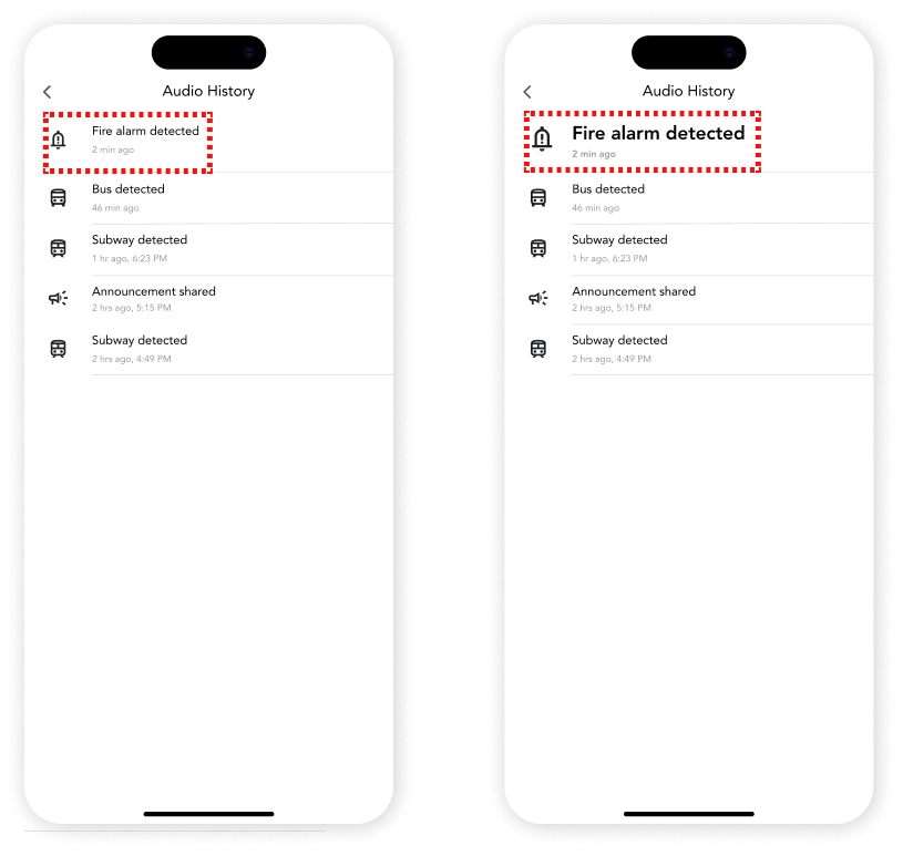
2 – The audio history feature was initially perceived as hidden, and participants expressed uncertainty about its necessity
Alerts were highlighted by bolding and increasing the size of text to emphasize the most recent event.
The original flow let users view audio alert history, but alerts lacked prominence, and timestamps were unclear.
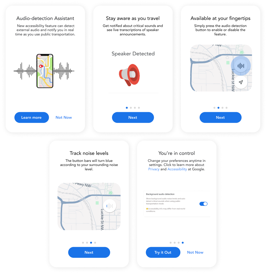
3 – New features lacked memorability, but what would it take to improve them?
While a reminder feature could highlight the functions, I proposed that it might increase cognitive load, resulting in more drawbacks than benefits.
REFLECTION
Establishing strong relationships valuably shaped our prototype
We worked with several participants multiple times, which was rewarding as they could see how their feedback directly shaped further iterations.
Incorporating Surveys for Broader Feedback
While one-on-one sessions with a small group provided valuable insights, we recognize the need for broader data collection.